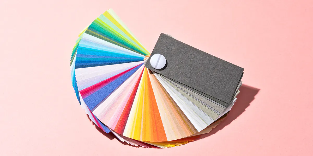
Every year since 2000, the world of art and design awaits the Pantone 'Color of the Year.' The choice is not random, but tends to capture the essence of the period and reflect its nuances. From bold to soothing colors, each shade has a different story to tell and expresses a color ethos with which to enter the New Year.
Related: The Colors of Controversy
Initially aimed at graphics and design, the 'Color of the Year' has become a global cultural phenomenon that influences other creative fields, such as fashion, furniture and art. Far from being just a trend, the Pantone color is a kaleidoscopic reflection of today's society.
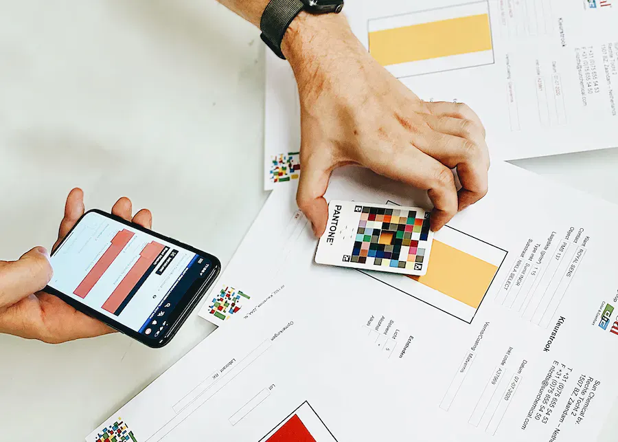
The Pantone 'Color of the Year' selection process involves a global team of color experts at the Pantone Color Institute, an American company recognized as an authority thanks to its long history of providing color solutions and commitment to study and promotion of the language of color. Experts from the Institute explore new trends, taking into account influences from different sectors such as art, fashion, social media and even future sporting events.
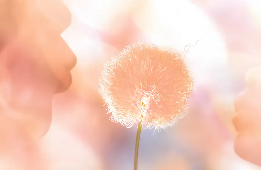
The color chosen for 2024 is Pantone 13-1023 Peach Fuzz, a timeless pink and orange shade that is both soft and comforting.
"In seeking a hue that echoes our innate yearning for closeness and connection, we chose a color radiant with warmth and modern elegance. A shade that resonates with compassion, offers a tactile embrace, and effortlessly bridges the youthful with the timeless," said Leatrice Eiseman, the Executive Director of the Pantone Color Institute.

The tone of Peach Fuzz can be easily integrated into everyday life, from clothing to furniture to beauty. For clothing, this peach shade is reassuringly enveloping and can be worn in a variety of ways, from soft and cozy sweaters to refined embroidered pieces or elegant silks. In the furniture sector, the color could be painted directly on walls or used in combination with other neutral colors for a soft and inviting space that instills serenity. In beauty products, Peach Fuzz could add a touch of lightness and freshness in a versatile way, from blushes to nail polishes, to all lip items.
Want to receive more articles like this via email? Sign up to our newsletter!

Last year it was Viva Magenta that was announced, while 2022 saw the triumph of the periwinkle blue with a purplish-red undertone called Very Peri. In 2021, two shades were presented instead of one: the Pantone 17-5104 Ultimate Gray and the Pantone 13-0647 Illuminating (a yellow hue). This was a choice inspired by the need to convey a "message of happiness supported by fortitude", as a response to the Covid-19 pandemic. The combination was celebrated in a collaboration with Brazilian shoe brand CARIUMA, which launched two new models of canvas sneakers, combining gray and yellow that invited us to walk towards the future with strength, joy and hope.
Related: You Can Now Dress Your Feet in the Pantone Colors of 2021
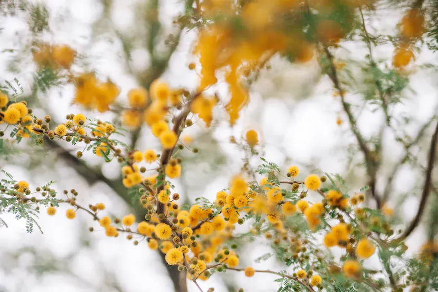
Yellow was also used in 2009 with Pantone 14-0848 Mimosa, an enveloping and warm color, which recalls some shades of the mimosa flower and the sun's rays, expressing optimism, joy and positivity. In times of economic uncertainty and political change, optimism becomes essential, and yellow stands as the color that best expresses hope and comfort.
Taking a dive into the past, another emblematic color was Cerulean, chosen to celebrate the new millennium, way back in 2000. Even if we now remember Cerulean above all for a famous scene from the film The Devil Wears Prada, this was the inaugural Pantone 'Color of the Year.' The pale blue that inspired calm and stability, like a serene and crystalline day, seemed like the right choice to enter the new millennium.
The Pantone 'Color of the Year' goes beyond the mere concept of a color trend. The annual selection is a reflection of aspirations, emotions and changes in society. From the beginning of the new millennium to the Peach Fuzz of 2024, each choice tells a story, with a name that intuitively communicates a universal creative message.